
What does a 3-year-old and your website visitors have in common?
When a 3-year-old doesn’t get what he wants, he goes sit at the corner and sulk.
When your visitors don’t get what they are looking for, they click away and never come back again.
Either way, you don’t get what you want them to do (eat broccoli, join your list, buy your stuff…)
We can’t help you with the picky eater, but we do know a few things about optimizing the conversation rate of your website through improving user experience (UX) design.
Good user experience design can help you optimize your conversion rate and increase sales, whether you are a service provider looking to schedule a sales conversation, or an eCommerce business aiming to make sales via your website.
What’s “User Experience (UX)”?
User experience (UX) focuses on enhancing user satisfaction by improving how we interact with the websites, applications and devices in our lives. In other words, UX makes complex things easy to use.
According to Forbes, studies have shown that companies that invest in UX see a lower cost of customer acquisition, lower support cost, increased customer retention and increased market share, based on a study done by Forrester.
Conversely, a poor user experience design can potentially harm your conversion rate.
88% of online consumers are less likely to return to a site after a bad experience. -@econsultancy
This nifty graphic from Semantic Studios sums up elements of good UX:

As you can see, there are many facets of UX, and all of them boil down to making your website easy to use, in a way that directs visitors to take the intended actions.
Besides creating satisfactory user journey that reflects the brand’s personality, good UX also addresses business needs to guide users to take actions that result in the website achieving business goals.
The rest of this article will break down these various criteria of good UX, and how they can achieve the business goal of increasing conversion rate for eCommerce websites:
- Useful and Valuable
Whether you’re selling a product or a service, you’re providing a solution to a problem. When your potential buyers go online to look for a solution, they are looking for something useful to them.
Their first encounter with you would likely be via a piece of content on your website. If they find it helpful, they would be more inclined to take the next step with you.
In this age of information overload, you have to go beyond presenting “raw data.”
One way is to organize the information in easy to digest format (such as infographics) and position it in a way that is relevant to your readers, to make the material useful.
To make sure your content attracts the right potential buyers, it’s important to have a thorough understanding of your target market so you can create content that they will search for and click through.
You may now wonder, how to determine what’s “useful” content?
Instead of guessing what your visitors think are valuable, why not just ask them?
Often time a well-designed survey with a few questions targeted to the right audience can give you the insight to boost SEO and drive targeted traffic, which will in turn increase your sale and conversion:
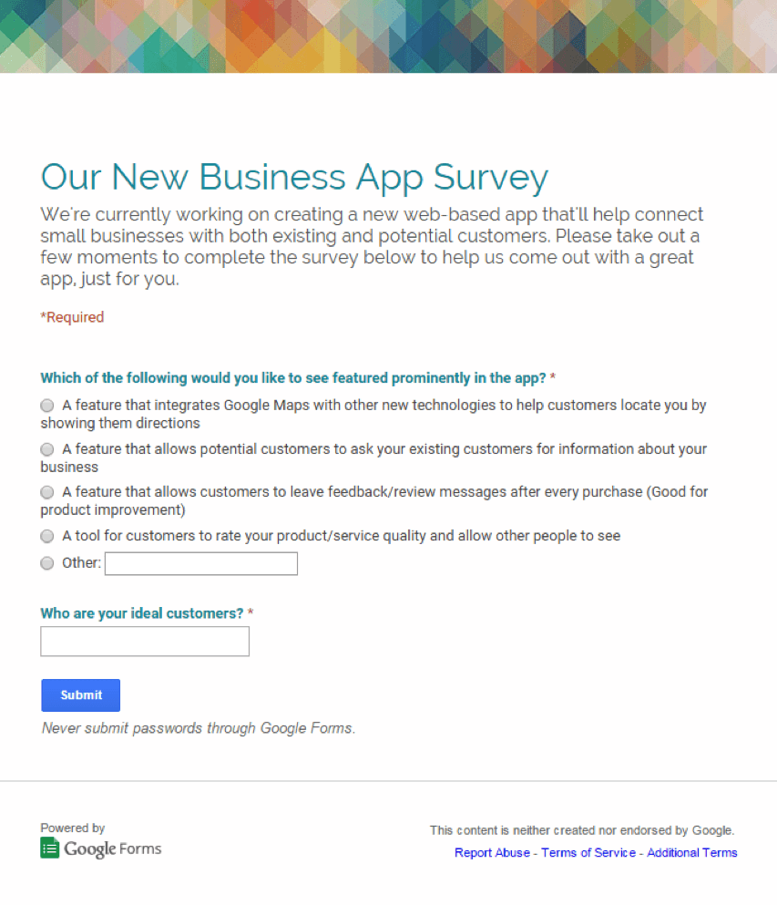
Image source: https://blog.kissmetrics.com/survey-questions-that-work/
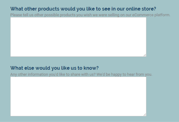
Image source: https://blog.kissmetrics.com/survey-questions-that-work/
After you created the content, how can you tell it’s indeed useful and valuable? A good indication is a low bounce rate, which means your visitors actually stick around and read your stuff.
If they spend time on your site viewing multiple pages, and spend a good amount of time on each page, there’s a good chance that they find your content useful.
A website with low bounce rate has simple, easy to use navigation.
Source: https://blog.kissmetrics.com/2-percent-bounce-rate/
We can theorize all day as to how people behave, but the proof is in the pudding. A tool that measures your visitors’ session time and browsing journey can give you real-life insight on what works and what doesn’t:
- Usable
Your content, products and services maybe useful and relevant, but if you tuck it under a rug, it’s not doing anybody any good. You have to make sure your visitors can utilize your website and the information.
This is particularly important for increasing conversion rate on sales pages, which need to address different reading styles and decision-making processes. They need to be informative and scan-able at the same time.
94% of a user’s first impressions are design-related. – @Veopix
Formatting can help dramatically improve a webpage’s usability by making the content easy to read:
- Use font size and typography that are easy to read.
- Use bold type and colors – sparingly and strategically – to call out important information.
- Use short paragraphs and ample line spacing in between – nobody likes to run into a wall of text.
- Use bulleted lists.
- Use techniques such as sliders, tabs, progressive layouts, structured grids, modal windows, rollover elements, accordions and mega drop-down-menus to organize content.
- Break up content into sections with subheads. Many people scan subheads to determine if they want to read the full text, so subheads should give your readers the “big picture” view.
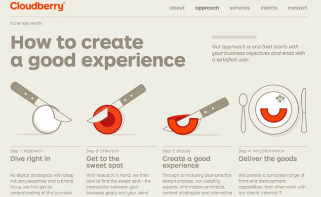
- Use visual and graphic to convey information and enhance storytelling.
- Include elements that communicate the content in multiple modalities – e.g. video, audio and text.
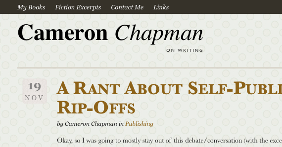
Simple layout and use of typography makes this website easy to navigate.
Image source: https://blog.crazyegg.com/2012/07/26/beautiful-font-combinations/
Using tabs to organize a large amount of information into easy-to-read format
Image source: https://www.smashingmagazine.com/2009/05/8-layout-solutions-to-improve-your-designs/
You also want to improve the usability of your conversion funnel to avoid customers getting lost and dropping out of the purchasing process altogether.
A few ways to improve conversion funnel design include:
- A simplified process so users are not required to jump through multiple hoops only to miss the last “submit payment” button in the last step! (and later call your customer service to ask “where’s my stuff?”)
- Clear instructions on required information to avoid error messages.
- Clear calls-to-action – the only call-to-action on a page should lead to the next step in the purchasing process.
- Confirmation and acknowledgement at the end of the purchasing process to add credibility and peace of mind, which encourage trust and repeat purchases.
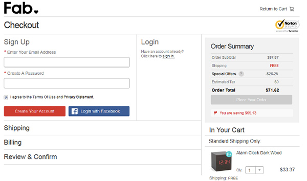
A single-page checkout helps keep everything in one place.
Image source: https://ecommerce-platforms.com/ecommerce-selling-advice/12-e-commerce-sites-inspirational-checkouts
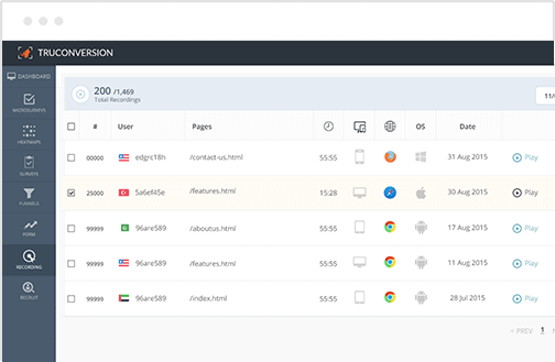
Installing a tool that tracks dropout in your conversion funnel can help pinpoint where the most impactful improvement can be made:
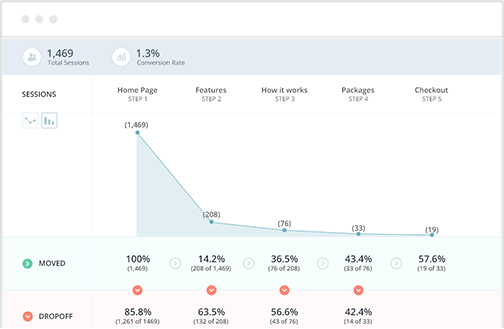
Once you know about the problem areas or pages, you can make adjustments right away to help decrease dropouts and improve conversion.
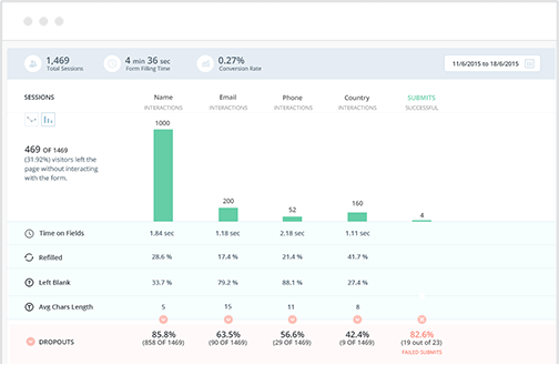
Another hurdle often encountered by eCommerce customers are forms that are too complex to navigate, either because they are not presented in an intuitive manner, asking for more information than necessary to complete the transaction, or come with insufficient instruction.
It’s not uncommon after a couple of error messages, your visitors would throw their hands in the air and give up on the checkout process.
When you know what difficulties they’re facing and how exactly they’re reacting to different fields on your forms, you can make the necessary changes to cut dropout rate and increase conversion:
Sometimes dropout along the conversion funnel could be caused by browser or device incompatibility. Good UX also ensures that checkout process is easy to navigate on all common browsers and devices.
57% of users say they won’t recommend a business with a poorly designed mobile site. – @Google

It’s imperative that your website and purchasing process checks out on mobile.
Image source: https://www.kinvey.com/blog/134/5-examples-of-brilliant-mobile-ux
- Findable
Your content can only be useful and valuable to your visitors if they can find it.
Your visitors can only buy your products or services if they can find the product they need or see the call-to-action to purchase.
The most critical element in helping your visitors find what they need is your website navigation. Good UX design should address site structure and how it is reflected in the navigation.
On a conversion-focused page (e.g. sales page), you also need to make the call-to-action apparent to the visitors, and make sure they are taking the intended actions.
47% of websites have a clear call-to-action button that takes users 3 seconds or less to see. -@GoGlobe
The best way to know if your navigation is doing its job is to observe how users interact with your website.
85% of UX problems can be solved by testing with 5 users. – @UltraLinx
Back in the days the only way was to sit in a focus group for the entire day to find out what the visitors are looking at, clicking on or interacting with, where they’re spending more time on a webpage and what makes them click away.
Yet the data could still be inaccurate because focus group participants might modify their behaviors because they are “under observation.”
Now you can use “Heatmaps” to track your visitors’ interaction with a page, what they are spending more time reading, and what actions they take as a result. The data can show you exactly where to put your calls-to-action for optimal conversion rate.
What if your visitors aren’t taking the desired action? How do you know if they are getting what they want from your site? Are they confused? Or is something else on the page distracting them?
Way back when, you had to whip out a clipboard and grill your focus group participants… and might still get an “I don’t remember the thing you’re talking about.”
Now, you can install micro survey tool right on your website, and ask the question real time to get the answer you need so you can present the information your visitors are looking for right where they need it:
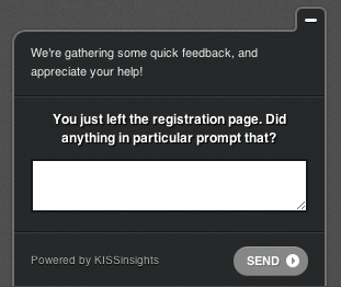
Example of a micro survey
Image source: https://www.gv.com/lib/micro-surveys-a-faster-way-to-learn-about-your-users
- Accessible
When a potential buyer cannot interact with your website because of certain physical or environmental limitations, you are losing a customer.
According to the Website Accessibility Initiative, web accessibility encompasses all disabilities that affect access to the Web, including visual, auditory, physical, speech, cognitive, and neurological disabilities (which affects almost 20% of the US population.)
If you are aware that a good portion of your market may experience such limitations, it’s imperative that accessibility be taken into account in your user experience design.
Good UX takes into account accessibility from the initial design phase, covering different user scenarios to help engineers design a platform that is as inclusive as possible.
- Credible
People trust and buy from credible sources. You can boost your conversation rate by demonstrating content and visual elements that enhance credibility on your website:
- Accuracy of information – include links to citations, sources and references to support your content.
- Legitimacy of your company – include physical address, photos and “badges” of professional organizations you belong to.
- Credentials and expertise of you and your team – highlight expertise, credentials, certifications, and/or membership to reputation professional associations. Only include links to credible external sites.
- Ease of contact – people are more likely to trust a company if they can interact with real people. Make it easy for your visitors to find your customer service phone number, physical address, and email address.
- Professional design – visitors often decide if they are going to stay on a website in less than a minute. Design and visual elements that are consistent and on-brand give the first impression needed for your visitors to stay and engage.
- Usability over bright shiny objects – avoid bells and whistles that are distracting and may even communicate the impression of a “fad” instead of a company that will stick around.
- Current content – make sure your content are up to date. Outdated content can make it look like you’re out of business.
- Error-free content – check the spelling and grammar of all your content, and install a tool to help you catch broken links.
- Site security verification – for eCommerce websites, it’s worth the small investment to get a SSL certification and display the badge on checkout pages to enhance trust and credibility.
User Experience design encompasses many aspects, from page layout to site structure to user journey and funnel design.
Many website owners fall into the bright shiny object trap, and let the “tools of the moment” decide the manner they interact with their visitors.
It’s often best to design your UX first to optimize your conversion rate, before you find the tools that deliver the intended experience.
Having tools such as heatmap, micro survey, funnel tracking, session recordings, and form analytics to measure and collect feedback so you can make adjustment real-time is also important.
A good UX designer can often get it “close enough” but validating a concept with real-life data can give you the insight you need to fine-tune, adapt and succeed in the ever-evolving online marketing landscape.


![15+ Top Black Friday & Cyber Monday Deals for Developers and Designers [2023]](/blog/content/images/size/w960/2021/11/black-friday-deals-developers-1.jpg)
